Use Bear React Carousel to Juejin a level Carousel

I'm using the open-source library I previously developed, Bear React Carousel, to see how far I can replicate the functionality of the membership level carousel from the Juejin app. We had similar requirements at my previous company. Without further ado, let's get started.
Requirements
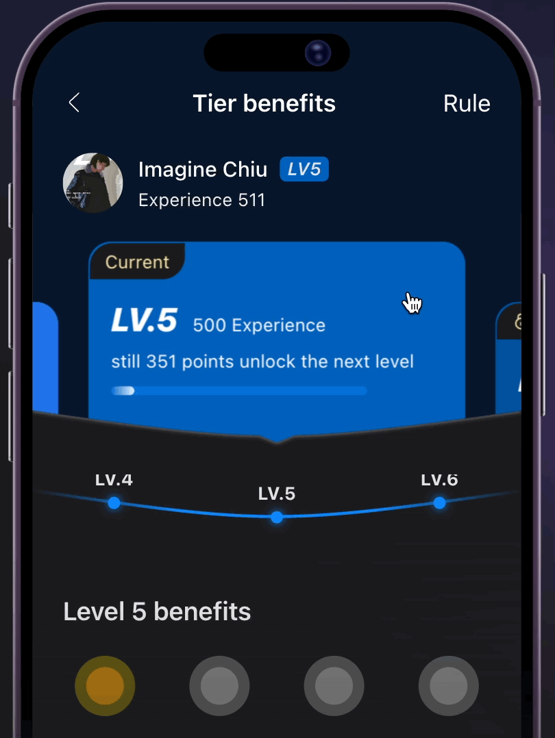
First, let's take a look at the preview results of Juejin on the mobile app

- The scrollable area is limited to the card section.
- When scrolling, the level cards should move upwards.
- The selected level card should be centered.
- The area below the level card should be partially obscured with a curved shape, not fully visible.
- The level names should move synchronously with the cards.
- As the level names move, the curved shape should also move.
- The level name lines should move in sync.
- When retrieving data from the API, the preset should be positioned at the selected level without any animated movement.
Development Carousel
The carousel project can be divided into:
- Level cards, displaying 1.2 of them and centering.
<BearCarousel
    slidesPerView={1.2}
    spaceBetween={20}
    isCenteredSlides={true}
    // ...ignore
/>
- Level names
- level lines both of which should display 3 and be centered.
<BearCarousel
    slidesPerView={3}
    isCenteredSlides={true}
    // ...ignore
/>
So the development goal is to synchronize the movement of level names and level lines when moving the level cards.
import React, {useCallback, useEffect, useRef, useState} from 'react';
import BearCarousel, {TMoveEffectFn, TBearSlideItemDataList, BearSlideCard, elClassName, Controller, TOnSlideChange} from 'bear-react-carousel';

const MemberLevelWrapper = () => {
   const carouselMainRef = useRef<BearCarousel>(null);
   const carouselMetaRef = useRef<BearCarousel>(null);
   const carouselLineRef = useRef<BearCarousel>(null);

   return <>
        {/* Level Card */}
        <BearCarousel
            ref={carouselMainRef}
            syncCarouselRefs={[carouselMetaRef, carouselLineRef]}
            slidesPerView={1.2}
            spaceBetween={20}
            isCenteredSlides={true}
            // ...ignore
        />

        {/* Level Name*/}
        <BearCarousel
            ref={carouselMetaRef}
            // ...ignore
        />

        {/* Level Line */}
        <BearCarousel
            ref={carouselLineRef}
            // ...ignore
        />
    </>;
};
Next, when scrolling, the level cards will move upwards, and we need to implement a new Animation Effect function
import BearCarousel, {TMoveEffectFn} from 'bear-react-carousel';

const mainMoveEffectFn: TMoveEffectFn = useCallback((percentageInfo) => {
    const transformY = 40;
    return {
        transform: `translate(0px, ${-transformY * (percentageInfo.calcPercentage - 1)}px)`,
    };
}, []);

<BearCarousel
    ref={carouselMainRef}
    syncCarouselRefs={[carouselMetaRef, carouselLineRef]}
    moveEffect={{
        moveFn: mainMoveEffectFn,
    }}
    // ...ignore
/>
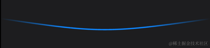
The level names should move in an arched pattern.
const levelNameMoveEffectFn: TMoveEffectFn = useCallback((percentageInfo) => {
    const transformY = -19;
    return {
        transform: `translate(0px, ${-transformY * (percentageInfo.calcPercentage - 1)}px)`,
    };
}, []);

<BearCarousel
    ref={carouselMainRef}
    moveEffect={{
        moveFn: levelNameMoveEffectFn,
    }}
    // ...ignore
/>
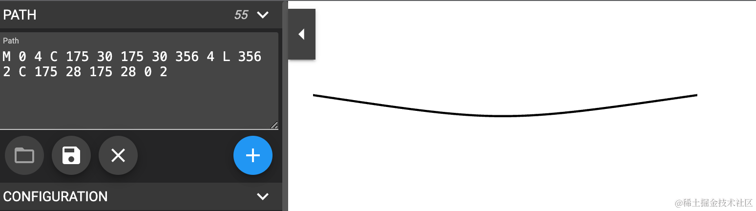
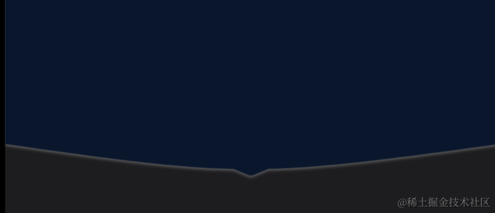
As for the arched section, we will ultimately use a masking technique for display. We should also disable NavButton, Pagination, and MouseMove. If you're not familiar with SVG drawing, you can use this tool.
<LevelLine>
    <LineBearCarousel
        ref={carouselLineRef}
        data={lineData}
        slidesPerView={3}
        isCenteredSlides={true}
        isEnableNavButton={false}
        isEnablePagination={false}
        isEnableMouseMove={false}
    />

    <svg height="100%" width="100%">
        <clipPath id="wave12">
            {/*跟隨線*/}
            <path d="M 0 4 C 175 30 175 30 356 4 L 356 2 C 175 28 175 28 0 2" stroke="black" fill="transparent"/>
        </clipPath>
    </svg>
</LevelLine>
The masking for the Level Card should be the same, but it's divided into three sections.
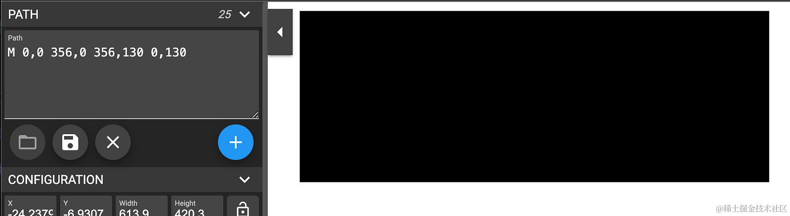
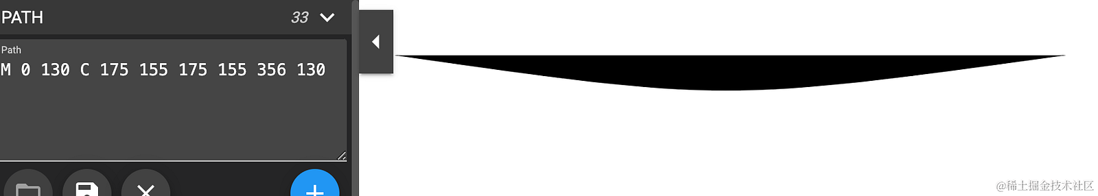
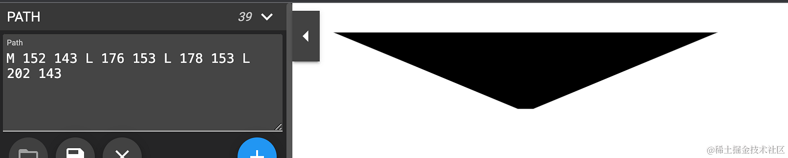
<svg height="100%" width="100%">
    <clipPath id="wave10">
        <path d="M 0,0 356,0 356,130 0,130" stroke="black" fill="transparent"/>
        {/* 圓弧 */}
        <path d="M 0 130 C 175 155 175 155 356 130" stroke="black" fill="transparent"/>
         {/* 下箭頭 */}
        <path d="M 152 143 L 176 153 L 178 153 L 202 143" stroke="black" fill="transparent"/>
    </clipPath>
</svg>
Lastly, the final part is moving to the preset selected level without any animation.
const [carouselMainController, setMainController] = useState<Controller>();
const [currLevel, setCurrLevel] = useState<{lv: number,count: number}|undefined>();


useEffect(() => {
    carouselMainController?.slideToPage(5, false);
}, [carouselMainController]);


<BearCarousel
    ref={carouselMainRef}
    syncCarouselRefs={[carouselMetaRef]}
    onSlideChange={handleSlideChange}
    setController={setMainController}
    slidesPerView={1.2}
    spaceBetween={20}
    isCenteredSlides={true}
    // ...ignore
/>
The finished result
The current progress is presented as a file for demonstration. If you'd like to try it out, you can visit bear-react-carousel.pages.dev. That's pretty much it. If you need both sides to move, they sync with each other in the Bear React Carousel. Because they are independently synchronized, there won't be circular control. It means A controls B and C, but B doesn't automatically control C. So, you can see here that A controls B and C.